
Which Countertop Colors Suit Denver Homes in 2026?
The countertop colors suiting Denver homes in 2026 are warm neutrals such as cream, greige and taupe, whites with soft gold or tonal veining, and quartzite looks in the Taj Mahal family. Deep charcoal and forest green work as accents, and matte or honed finishes are replacing high gloss.
Color is the decision that makes homeowners hesitate longest, and for good reason. Cabinets can be repainted and hardware swapped in an afternoon, but a countertop stays put for a decade or more, so picking a shade that dates badly is an expensive kind of regret.
What makes 2026 easier is that the direction is unusually consistent. The cool gray and stark white palette that ran through the late 2010s has been softening for several years, and the replacement is warmer, quieter and closer to what natural stone looks like when it comes out of the ground.
In this guide, you’ll learn which color families are moving in Denver kitchens this year, why finish matters as much as color, how veining scale has changed, which colors hold up past the trend cycle, and how to test a shade against your own cabinets and light.
Which Color Families Are Moving in 2026?
Four groups cover most of what is selling this year, and they overlap more than they compete. Designers interviewed by Homes and Gardens in June 2026 described the shift plainly: stark white counters are starting to read as clinical, and warmer tones with some visual interest are taking their place.
| Color family | What it looks like | Pairs with | Reads as |
|---|---|---|---|
| Warm neutrals | Cream, ivory, greige, taupe, mushroom | Wood cabinets, painted neutrals, brass | Calm and grounded |
| Evolved whites | White with soft gold, tan or tonal veining | White and light gray cabinets, chrome or black | Bright without feeling sterile |
| Quartzite looks | Creamy beige backgrounds with golden movement | Warm woods, bronze and brushed finishes | Natural and characterful |
| Moody darks | Charcoal, deep brown, forest green | Light cabinets, wood islands, matte black | Deliberate and contained |
Warm Neutrals Over Cool Gray
The clearest move is away from steel gray and toward creamy, earthy backgrounds. These tones sit well beside the oak and walnut cabinetry that has come back into Denver kitchens, and they hide everyday crumbs and water spots better than a cold white does.
Whites That Are Not Stark
White is not going anywhere, it is simply getting warmer. The whites selling now carry soft gold, tan or tone-on-tone veining rather than a hard gray river across the slab, which keeps a kitchen bright without the clinical edge.
Darks as Accents
Deep charcoal and green stones still turn up, but usually on an island or a bar rather than across every run. Natural soapstone, a talc-rich metamorphic stone, is part of this story in its gray-green range, and it suits people who actually like the way a surface changes with use.
Why Does Finish Matter as Much as Color?
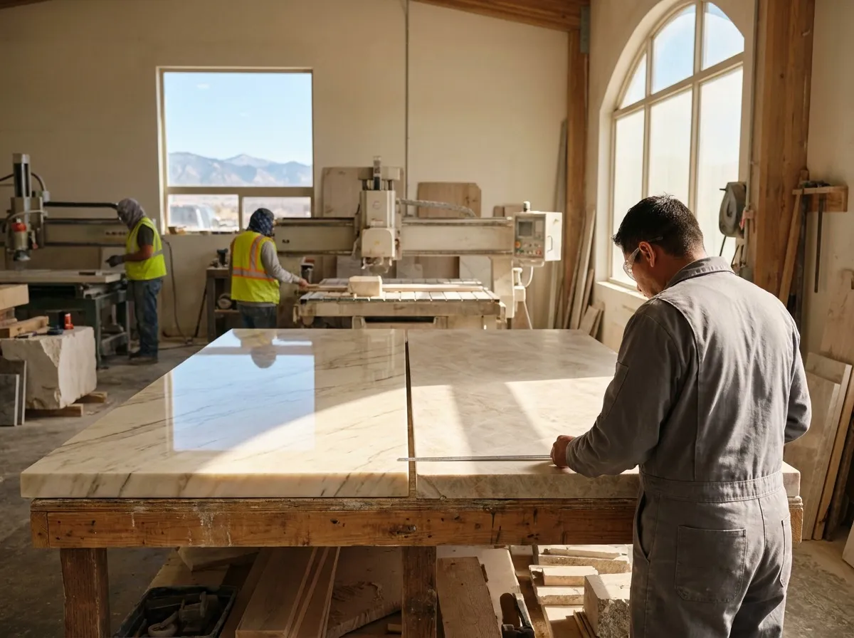
The same slab reads as two different colors depending on how it is finished, which is why finish belongs in the color conversation rather than after it. The broad move this year is away from high gloss and toward surfaces with some texture.
| Finish | What it does to color | Best for |
|---|---|---|
| Polished | Deepens color, sharpens veining, reflects light | Darker kitchens, spaces needing brightness |
| Honed | Softens color, mutes veining, cuts glare | Warm neutral palettes, busy family kitchens |
| Leathered | Adds subtle texture, holds color depth | Dark stones where gloss would look heavy |
| Tumbled | Softened, slightly aged surface | Traditional and rustic spaces |
A honed finish is doing a lot of work in 2026 palettes, because it keeps a warm neutral looking soft rather than shiny. On marble it also hides minor etching more readily, which matters since marble etches when acidic spills sit on it. Whatever finish you choose, periodic sealing still applies to natural stone.
How Has Veining Changed?
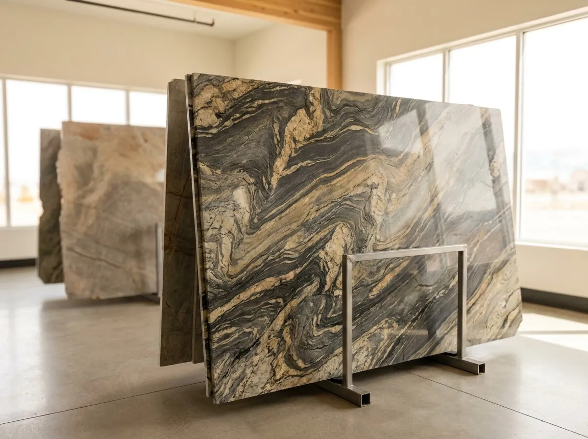
Scale is the quiet shift. The oversized, high-contrast veining that dominated a few years ago has given way to finer, more organic movement, with the vein color sitting closer to the background color.
That change matters more in a small kitchen than a large one. A bold river of contrast across a compact run can make the whole space feel busy, while tone-on-tone movement gives the surface character without competing with cabinets, tile and hardware.
Three patterns are worth knowing by name when you shop:
- Tone-on-tone movement, where the veining is only a shade or two from the background
- Fine linear veining, which reads almost as texture across a long run
- Bookmatched slabs, where two slabs mirror each other across an island or a backsplash
| Veining scale | How it reads on a run | Suits |
|---|---|---|
| Bold, high-contrast rivers | Dominant, draws the eye to the slab | Large islands in open kitchens |
| Tone-on-tone movement | Calm, adds depth without noise | Small and mid-size kitchens |
| Fine linear veining | Almost textural across a long run | Modern and transitional spaces |
| Bookmatched pairs | Symmetrical mirror across two slabs | Feature islands and full-height backsplashes |
Bookmatching is the one to raise early, since it requires slabs from the same block and a layout planned before anything is cut.
Which Colors Last Past the Trend Cycle?
A trend is only useful if it survives the next one. The colors that last tend to be the ones tied to permanent things in the house rather than to a moment in design.
- Warm whites and soft creams work with almost any cabinet color, which is why they outlive palettes built around a single accent shade.
- Mid-tone neutrals such as greige and taupe hide daily use and read differently under morning and evening light without looking wrong in either.
- Natural stone with genuine movement ages better than a manufactured pattern that was fashionable in one specific year.
- Deep tones used selectively, on an island or a bar, are easier to live with and cheaper to change than a whole kitchen in a dark stone.
The question worth asking is whether the color still works if you repaint the walls, change the hardware or replace the flooring. If the answer is yes, the color is doing its job.
How Do You Test a Color Before You Commit?
Photos lie about color, and showroom lighting is not your lighting. Testing is straightforward if you do it in the right order, and it takes one visit rather than three.
Bring a cabinet door, a flooring sample and a photo of the space taken at the time of day you use it most. Look at full slabs rather than chips, since veining that reads as quiet on a small sample can dominate a finished run. A countertop design consultant can narrow the options quickly once those three things are on the table.
Then check the slab under both light conditions. Warm bulbs push a white toward cream, cool daylight pulls a beige toward gray, and the difference between the two is often larger than the difference between two slabs you are weighing. Seeing it yourself settles the question faster than any comparison chart.
What Granite and Marble Designs Provides for Color Selection
Granite and Marble Designs has worked with Denver homeowners, contractors and commercial clients since 2007, with granite, marble, quartz, quartzite, porcelain, onyx, travertine, limestone and soapstone all carried in house. Working with a stone countertop company in Denver, CO that fabricates and installs what it sells means the slab you approve is the slab that gets cut.
Stone design consulting covers selection by use case, color and finish recommendations, and project management through to completion.
Stone fabrication covers laser templating, slab layout that decides where the best movement lands, and CNC fabrication with SABERjet equipment.
Stone countertop installation completes the work with high-quality sealing and near-imperceptible seams.
Slab and remnant inventory gives you full slabs to walk around rather than sample chips to guess from.
The fastest way to settle a color is to see full slabs under showroom lighting with your own samples in hand. When you have a shortlist, get in touch about picking your countertop color and bring the cabinet door with you.
Key Takeaways
- Warm neutrals are the defining move of 2026. Cream, ivory, greige and taupe backgrounds are replacing the cool grays that dominated the previous decade in Denver kitchens.
- White is still strong, but the whites selling now carry soft gold or tonal veining rather than hard gray contrast. The result stays bright without reading as clinical.
- Quartzite looks in the Taj Mahal family, with creamy beige backgrounds and golden movement, suit the warm wood cabinetry coming back into local kitchens.
- Finish changes color as much as the stone does. Honed and leathered surfaces are replacing high gloss, and honed marble also hides minor etching more readily.
- Veining has moved from oversized, high-contrast rivers to finer tone-on-tone movement, which suits smaller kitchens far better.
- Test any color against your own cabinets and your own lighting, at the time of day you use the space, before you commit to a slab.
Frequently Asked Questions
What is the most popular countertop color right now?
Warm neutrals lead in 2026, particularly cream, greige and taupe backgrounds with soft veining. Warm whites remain close behind, and both suit a wide range of cabinet colors and hardware finishes.
Are gray countertops out of style?
Cool, steel gray has lost ground to warmer tones, but gray has not disappeared. Warm-leaning grays and greige still work well, especially where the cabinets and flooring carry cool undertones already.
Do dark countertops make a kitchen look smaller?
Dark stone absorbs light, so a small kitchen finished entirely in it can feel heavier. Using a dark stone on the island with lighter perimeter runs keeps the drama without closing the space in.
Is green countertop stone a passing trend?
Green quartzite and soapstone have been building for several years rather than arriving suddenly. Used on an island or bar rather than every run, they are easier to live with long term.
Which countertop color hides everyday wear best?
Mid-tone neutrals with some movement hide crumbs, water spots and light marks better than either stark white or solid black. Honed finishes help too, since they show fewer fingerprints.
Should the countertop match the cabinets or contrast them?
Either works, provided the undertones agree. Matching creates a calm, unified look, while contrast defines the counter. The mistake is mixing a warm cabinet with a cool countertop.
Does a warm white countertop work with white cabinets?
Yes, and it usually looks better than matching a stark white to a stark white. A warm white counter gives the cabinets definition instead of blending into them flatly.
How does Denver light affect countertop color?
Light changes any color, so check a slab under both daylight and your evening fixtures. Warm bulbs push whites toward cream, while cooler bulbs pull beige toward gray.
Is bookmatching worth doing?
It is striking on an island or a full-height backsplash, but it needs slabs from the same block and a layout planned before cutting. Raise it at selection rather than later.
Can I mix two countertop colors in one kitchen?
Yes. A different stone on the island is a common approach, and it lets you use a bolder color in one place while keeping the working runs calm and practical.
Conclusion
The 2026 palette is warmer, softer and closer to natural stone than anything the last decade produced. Warm neutrals, gently veined whites and quartzite looks cover most Denver kitchens, with darker tones earning their place as accents rather than as the whole scheme.
Choose against your cabinets, your flooring and your light rather than against a trend list, and the color will still look right long after the trend has moved on. View full slabs, take your time with the finish decision, and let the layout put the best movement where you will see it.
Call Granite and Marble Designs at 303-536-8808 to schedule a design consultation about your countertop color.